2009 Federal Revenue and Spending Book of Charts

Very interesting series of charts and graphs giving a graphical picture of our current and future economic situation within the U.S. The link below is for downloading these series of charts:

Link (This download is about 10MB – large, but the charts are worth it)

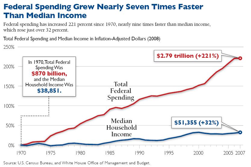
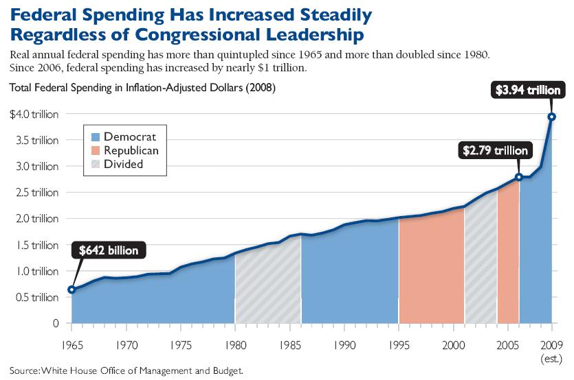
Here are a couple of examples:

Federal Spending Grew

Federal Spending Increases

Leave a Reply

Fill in your details below or click an icon to log in:

WordPress.com Logo

You are commenting using your WordPress.com account. Log Out /  Change )

Facebook photo

You are commenting using your Facebook account. Log Out /  Change )

Connecting to %s

%d bloggers like this: